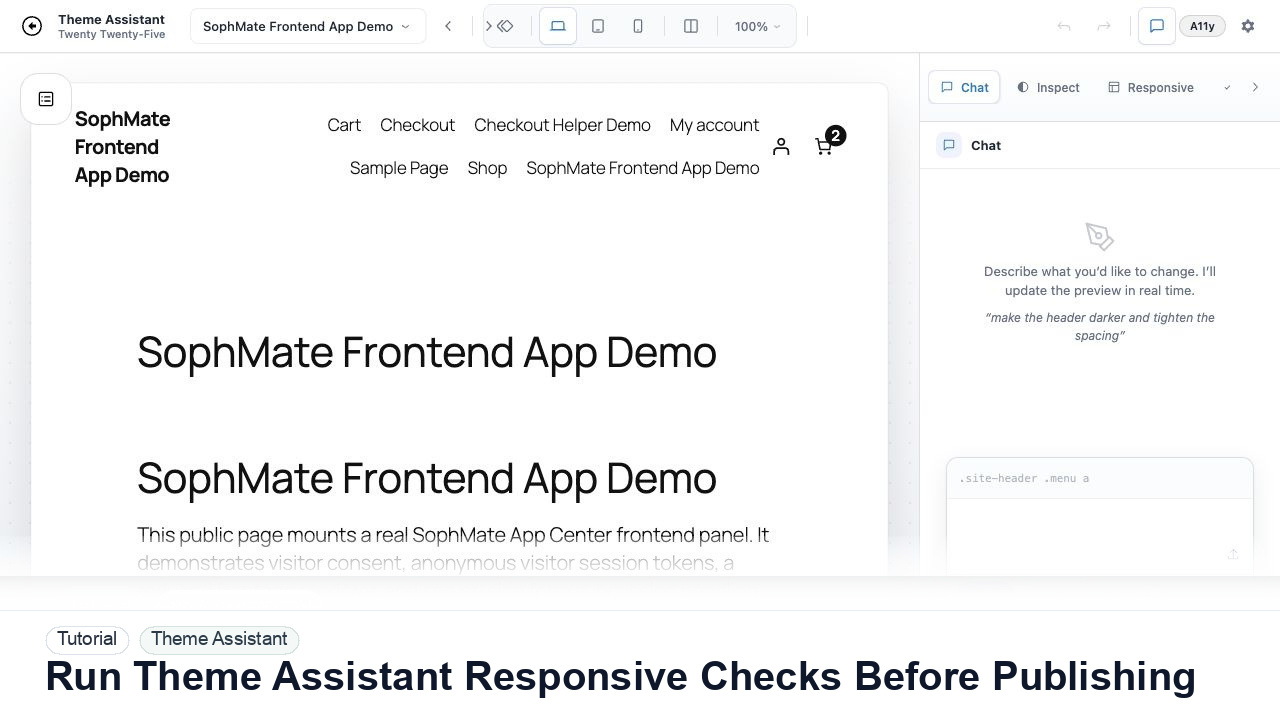
Run Theme Assistant Responsive Checks Before Publishing
Switch Theme Assistant between desktop, tablet, and mobile views to catch spacing, navigation, overflow, and CTA issues before publishing CSS.
Switch Theme Assistant between desktop, tablet, and mobile views to catch spacing, navigation, overflow, and CTA issues before publishing CSS.
By the end of this tutorial, you will know how to use SophMate for WordPress responsive design AI while keeping the work reviewable inside WordPress.
A CSS change looks good on desktop, but the team needs to verify the store header and checkout CTA on mobile.
The tutorial image shows Theme Assistant context: live preview, design controls, responsive review, and presentation-oriented workflow areas for visual changes.
Use scoped CSS, responsive checks, accessibility review, and history notes before publishing visual changes.
Do not run responsive checks in isolation. Open the exact CSS or design proposal that is being considered.
Use desktop, tablet, and mobile buttons in the toolbar. Check the same section at each size rather than browsing randomly.
Watch for horizontal scroll, hidden CTAs, overlapping text, tap targets below comfortable size, and navigation that becomes hard to use.
If mobile breaks, ask Theme Assistant to refine only the affected CSS rules and keep the desktop structure intact.
Before approval, write a short note describing which breakpoints were checked and what changed.
The Theme Assistant workflow is successful when the change is scoped, reviewed at key breakpoints, accessibility concerns are documented, and the team can revert or explain the CSS history.
Document target page, selector or component family, desktop/tablet/mobile checks, accessibility notes, CSS history label, and approval status.
A designer owns visual intent, while the site owner or developer owns production impact. Review every meaningful CSS change before publishing.
Escalate when CSS affects checkout, account, accessibility, mobile navigation, or theme structure beyond the intended visual scope.
Run this workflow on a low-risk example first. Once the result is easy to review and explain, decide whether it should become a repeatable playbook, workflow, watcher, agent, or documented team process.
Next step
Review the SophMate listing for current package details, screenshots, compatibility notes, and license terms.
Related
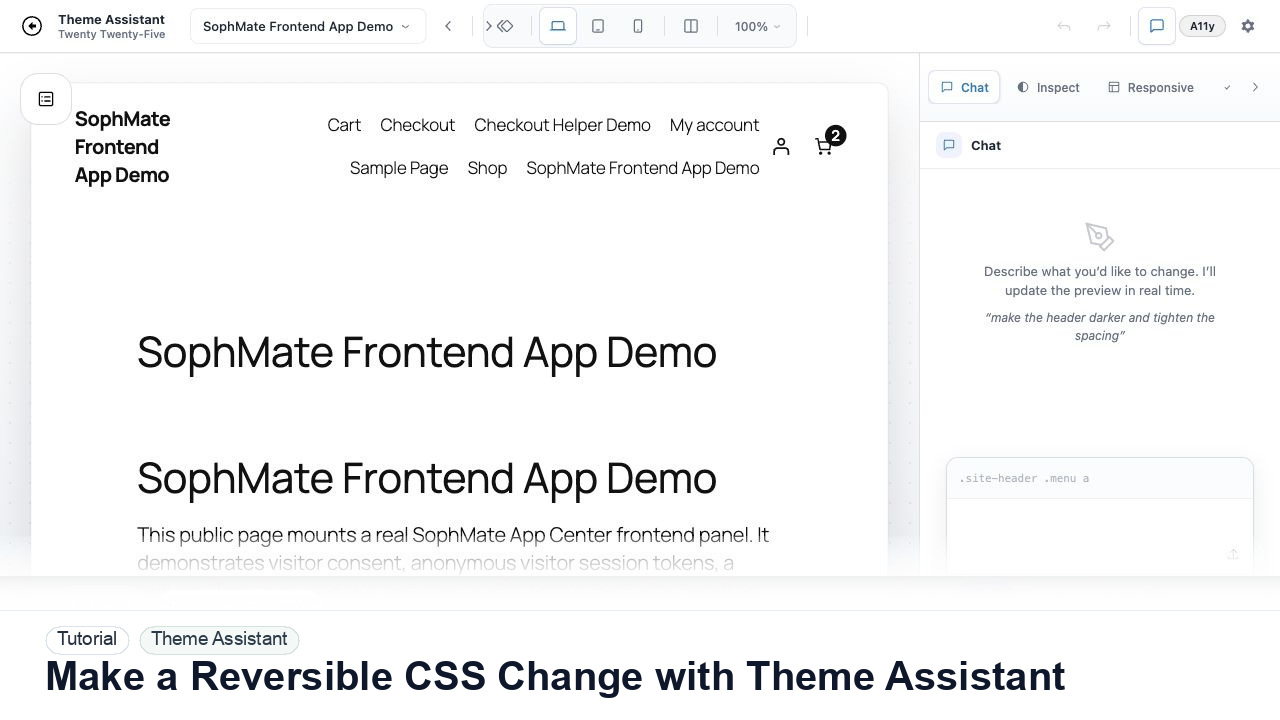
Use Theme Assistant to request a CSS refinement, inspect the preview, review generated CSS, and keep the change reversible through history.
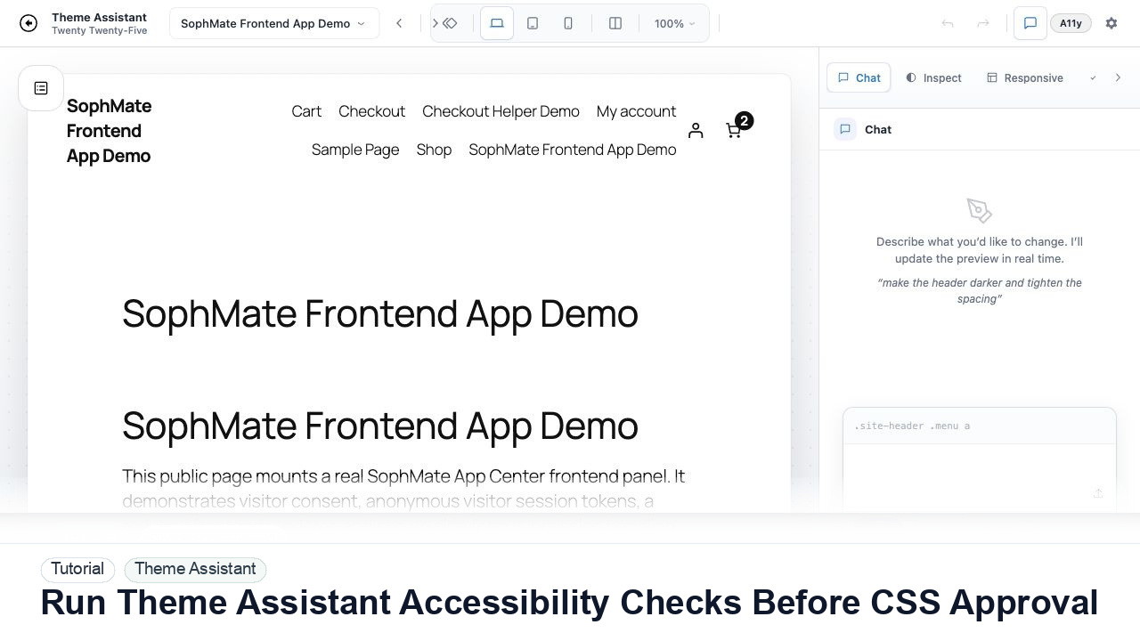
Use Theme Assistant accessibility checks to review contrast, hierarchy, spacing, and tap-target concerns before approving AI-generated CSS.
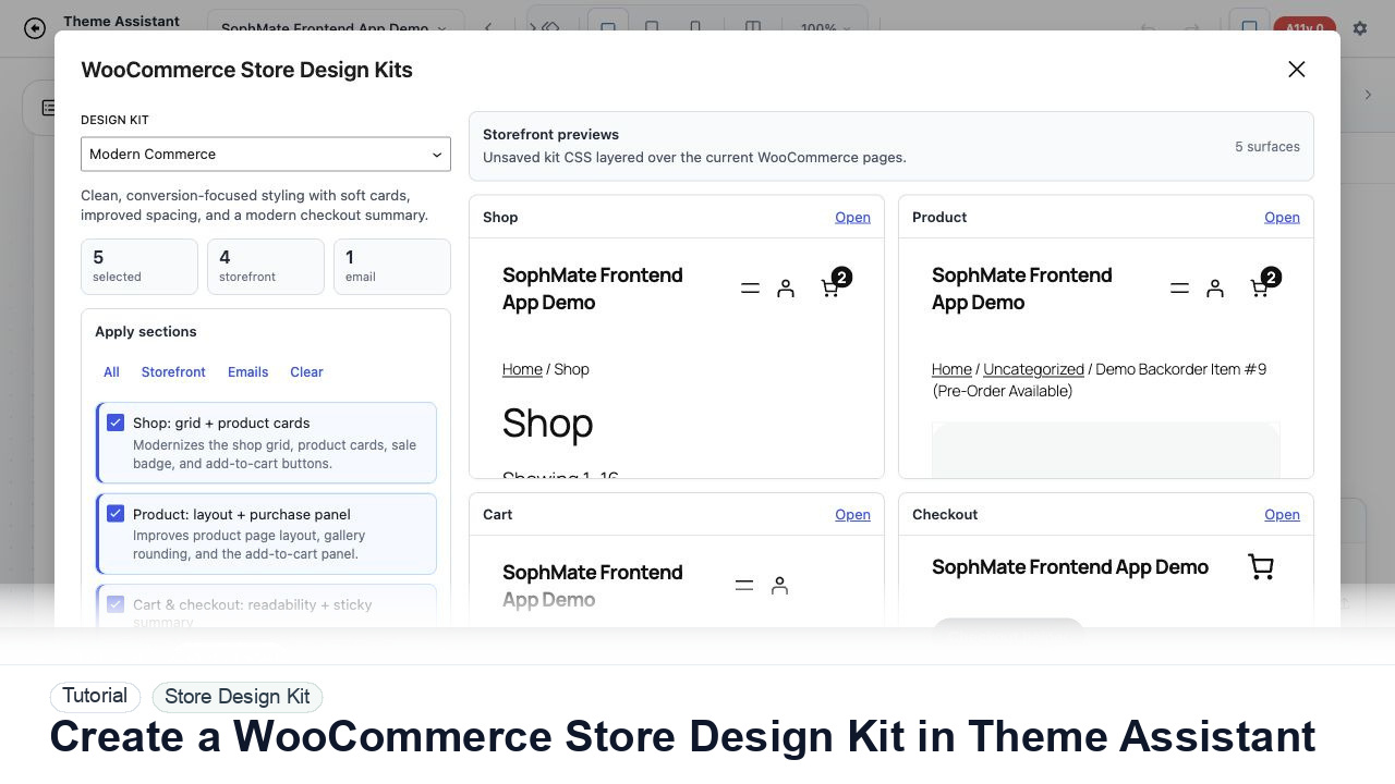
Use Theme Assistant to gather tokens, page patterns, product-card styling, checkout cues, and reusable CSS guidance for a WooCommerce design kit.